
This post is a precursor to a series of posts, two of which are being released simultaneously. It's the necessary backstory to the series. Scroll to bottom for links to each related post.
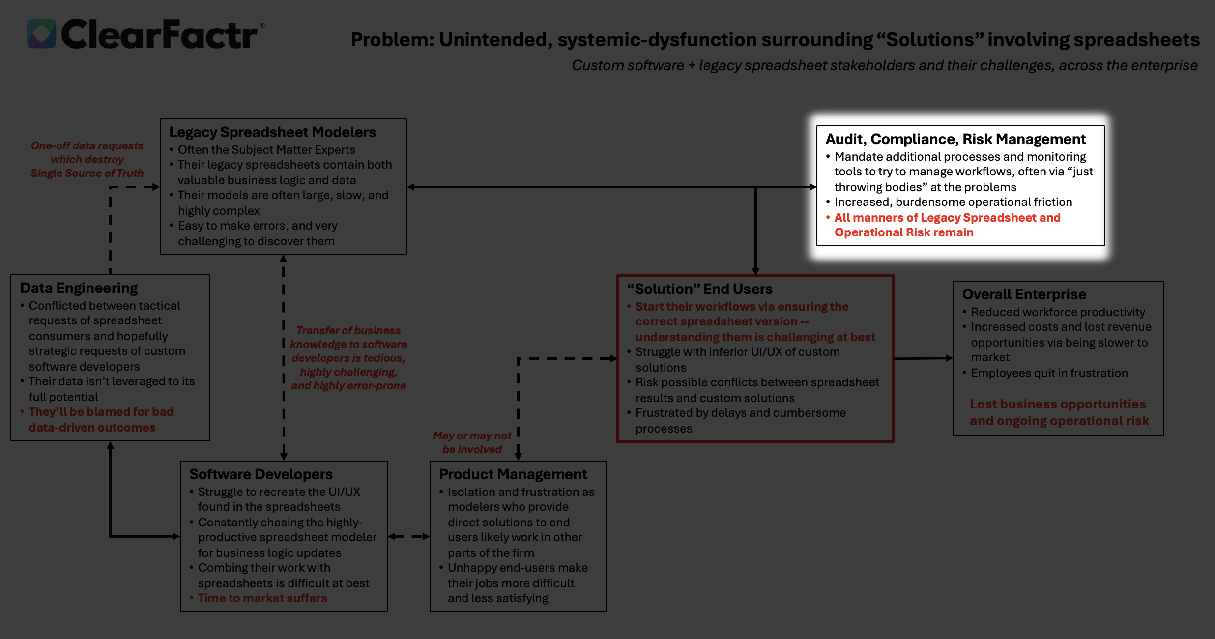
Over a year ago I came up with two diagrams that describe what we typically see at the enterprise, before and after ClearFactr arrives. I personally feel I've never been able to improve upon their compactness and richness, and indeed, the themes of the two slides inform the totality of this website. Here's the Before:


One time during a presentation of ClearFactr to a senior banking person, I had opened the meeting with the "Before" slide to set the stage, but was moving quickly towards the product demo, fighting the omnipresent "hard stop" where I'd literally lose my audience. A person interrupted me and said "Wait a second, back up... [to the Before slide]." He walked closer to the big screen, stared at it for a bit, and then said "We have every one of those problems."
He and others got the diagram(s) quickly... but over many months, often enough I also heard variations of "Whoa!... lots going on on that page... explain it to me like I'm five."
If I can generalize about the types of people I wind up speaking with about ClearFactr, "they're very smart" would be a great place to start. "Explain it to me like I'm five" always felt somewhat off to me, bordering on a request for condescension.
I've had countless hours of conversations with "very smart" people about how to convey what's in the diagrams differently and more effectively. To me, they've all come up short, because their primary effectiveness comes from the fact that the entire picture -- before and after -- is exactly that: a single picture. The dynamics in any enterprise "with too many spreadsheets to count" (as we've come to say) are unapologetically complex, with many cohorts and departments of people (often entire floors of them), all doing their best to make the enterprise work. The "boxes and lines" get complicated-looking, but that's the reality we're dealing with: Big enterprises doing important work are filled with complexity.
No one would argue for unnecessary complexity, and that's where the second slide comes in. Now in fact, one person said to me "It's still a bunch of boxes and lines!" But when comparing the two diagrams, you'll see that every problem, risk, and "dysfunction" on the Before slide has a corresponding improvement and benefit on the After slide. ClearFactr can't change the people involved, or their organizational structures, but it can change the way they work with each other.
This is real world stuff. We've seen this every time, before and after ClearFactr is deployed.
In a series of subsequent posts I'm going to focus on one section of the Before slide and describe some of the dynamics further, in narrative form. Some of the words will be the same, and in total, there will be way more of them. But hopefully even more people will find them more effective.
Being effective is always the goal.
When Data Engineers and End-Users Pay the Price for Spreadsheet Sprawl
Tags: Enterprise, Spreadsheet Risk
This is post two of a series, important backstory here. End-users live in perpetual doubt. Every morning (or meeting!) starts with the same ritual: “Is this the latest file? Did someone email a new...
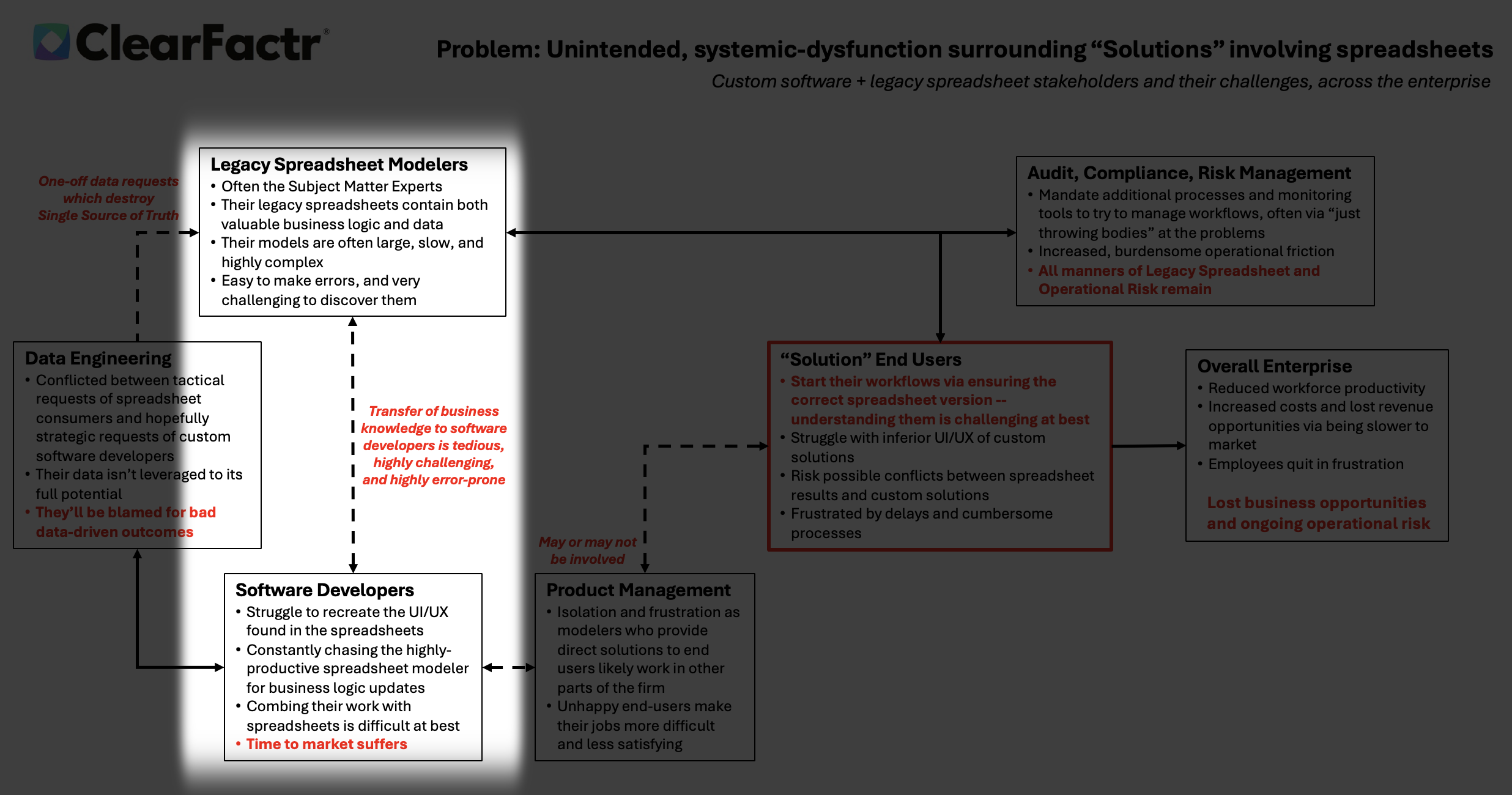
This is post three of a series, important backstory here. In the heart of many enterprises, a dotted line of friction divides two essential tribes: the Legacy Spreadsheet Modelers, often the unsung...
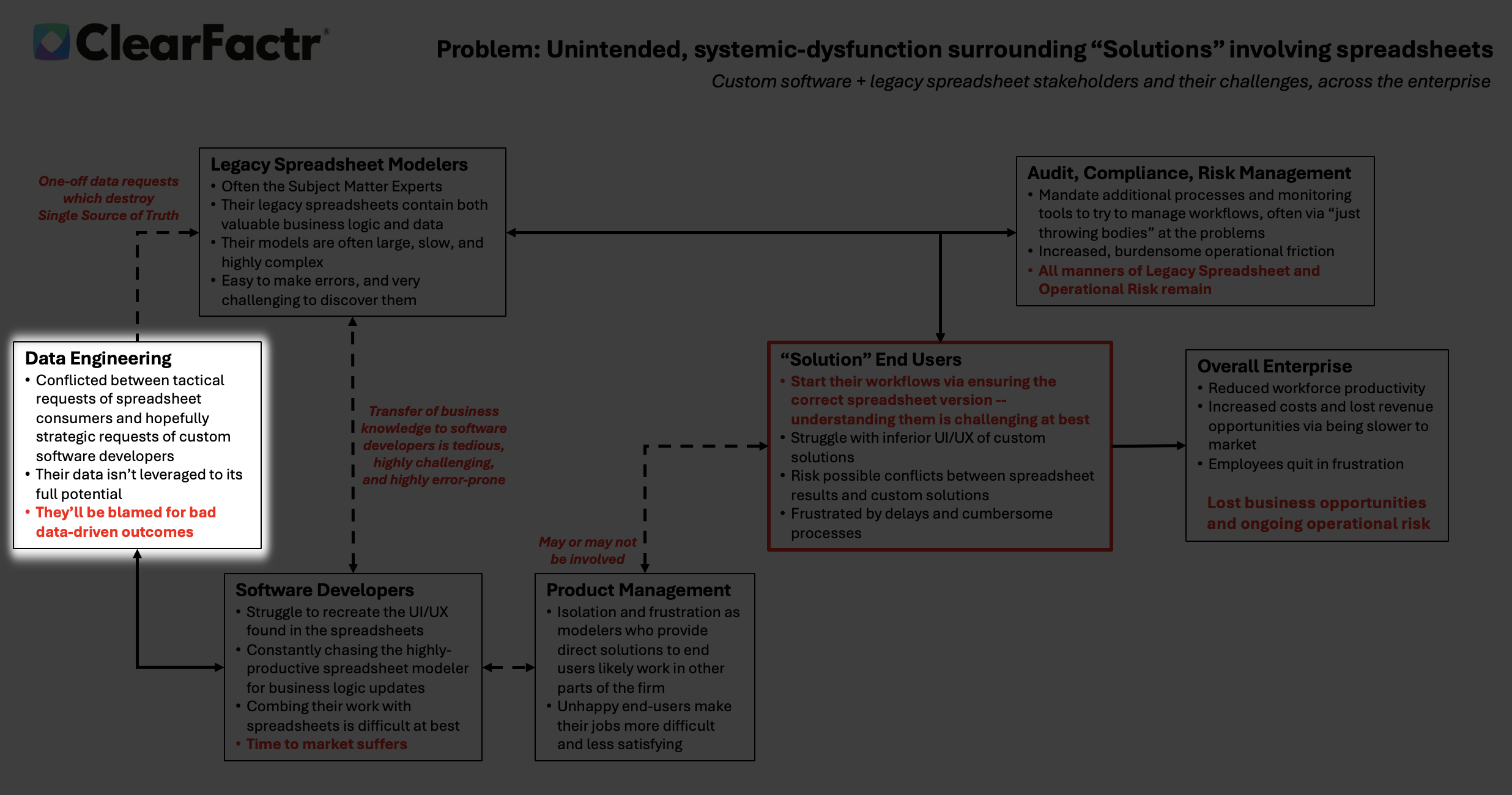
This is post one of a series, important backstory here. Data engineers are trapped in a vicious cycle: bombarded with urgent, one-off spreadsheet requests that fracture the single source of truth....